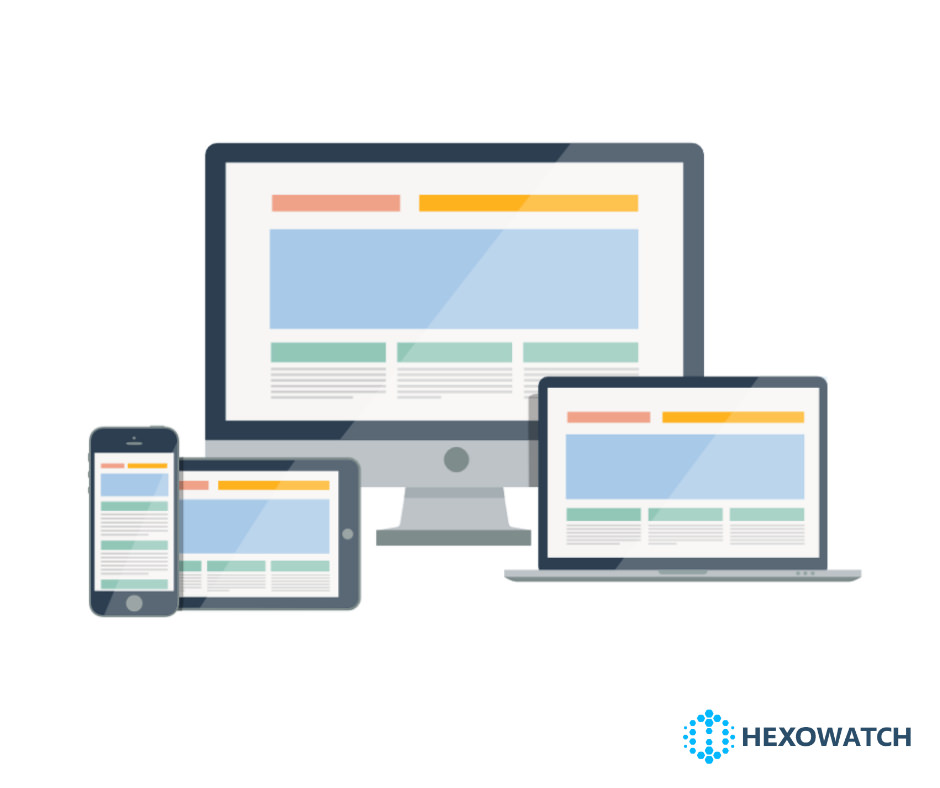
Our team has been busy cranking out lots of useful UX tweaks and added 8 different device types to monitor your pages from!
📊 First up, the monitored URLs page now has some nifty charts which show at a glance how many monitors you have active, and a breakdown of types of monitors you are using.
📌 This page also features the ability to filter monitors by type, status or by url and you can now see your monitors in list or grid view.
📋 Next, when you navigate to a monitored page you can now see the date the last check occurred and we now show alerts only by default (hiding ‘No change’). You can toggle the filter to show all changes too, and you can now see the last change alert snapshot below the alerts for easy reference.
🎯 The HTML element selection has been improved and should be more accurate than before.
💻📱🖥️ Lastly you can now specify one of 8 device types for the Visual and the HTML element monitors! These range from a small, medium or large mobile devices, tablet, laptop or even a 4K desktop monitor. This is ideal if you want to check a page from a specific device size.
CMO & Co-founder
Helping entrepreneurs automate and scale via growth hacking strategies.
Follow me on Twitter for life behind the scenes and my best learnings in the world of SaaS.
